Category

Web Design

about_us_banner_1282258081

Essentials for your About Us Page

By | Web Design | No Comments

Whether you don’t like writing about yourself, you’re not sure what goes there or because the whole thing just makes you feel plain awkward, writing the business About Us page is a task that intimidates many small business owners. You think you know what you want to say, but then you get to that blank WordPress page and you suddenly forget how long you’ve been doing this, why you love it or, sometimes, even the company name. But your About Us page doesn’t have to be something you dread. Instead, craft a page that you’re proud of and that helps communicate exactly who you are and what you represent to your customers. It’s easy!

One lesson we’ve all learned from the social media revolution is that people like doing business with people they know. And that’s the power of crafting a good About Us page. You give your customers a look into who you are, who your company is, and you build the trust they need to move forward with your business.

Below are five best practices to keep in mind when crafting your About Us page.

Tell a Story

Take a few moments and think about all the experiences you’ve had running your business. The funny ones, the proud ones, the ones that make you wince looking back at them. Pick a story that you think captures the essence of your business and what it represents and then use your About Us page to tell it to your customers. Maybe it was the day you first opened the business. Maybe it was your third anniversary when you looked around at what you had created. Avoid writing down your whole company history or regurgitating your company mantra. Instead, use your About Us page to tell a story that introduces customers to your business, displays your values and, most importantly, captures their attention and makes them want to learn more.

Share your Credentials

Don’t get so caught up in telling a compelling story that you forget to list your credentials. Potential customers want to know why they should trust you with their business. Share how you got started, what your experience is, how long you’ve been doing with this, any awards you’ve won, people you’ve worked with (if possible), associations you’re involved with, industry causes you support, etc. Why should a potential customer trust you with their business?

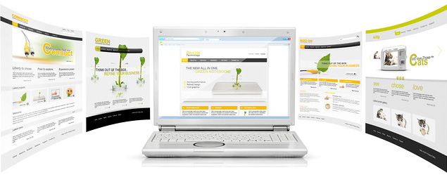
Introduce yourself with Pictures

If someone clicks on the link to your About Us page it’s a pretty clear sign they want to get to know you. Maybe it’s their first time on your site, or they just discovered your blog, or they’re thinking about making a purchase but want to make sure they can trust you first. This is your chance to let them peek behind the curtain and see what your team looks like. Get personal by including pictures of yourself, your real staff (no stock photos), the outside of your establishment, the office dog, etc. These images again build upon that story you’re trying to tell.

Let them know what they can expect from you

No, I don’t mean to list off all the services that you offer or the products that you sell. I mean to convey what kind of a business you are and what they can expect from their experience with you. What are some of your company’s core values? What sets you apart from everyone else? Don’t use this area to sell, but to humanize your company and to put a face on the experience. It may also mean linking to interior content that highlight content or views you think are important.

Tell them how to get to know you better

Provide links to other places you reside on the Web, be it a Twitter account, Facebook account, or a link to another social media forum. By providing these other outposts for people to check out it helps build trust in the company and shows that you’ll be easy to get a hold of if something goes wrong. As consumers, we like checking out how a company responds on Twitter or how they use Facebook to help us make judgments about what type of business they are.

Those are the five things I look for when evaluating a business (or personal) About page. What trust cues do you look for?

flashlogo

What the Demise of Flash Means for the User Experience

By | Web Design | No Comments

Adobe’s decision to cease development of the mobile Flash platform and increase their investment in HTML5-related efforts created perhaps the final piece of conclusive evidence that HTML5 is the current go-to technology for creating ubiquitous user experiences regardless of device.

While there’s been an abundant amount of discussion on what this means to developers, there’s been a lack of focus on what this means to the overall user experience (UX). If HTML5 thrives where Flash struggled and becomes the dominator in the choice for new mobile and desktop technology, will users benefit from the transition? Yes, as long as designers and developers do their jobs right.

Different stroke for different folks

It might seem strange to compare Flash and HTML5 at all, since they are so inherently different. Whereas Flash is proprietary, HTML5 is continually developing through open source collaboration. If Flash is a seasoned monarchy, then HTML5 is the wild wild west. It’s important to note that there are tons of applications and sites in which Flash and native apps will remain the preferred choice of implementation. However, that doesn’t mean that we can’t explore the major differences between the two in order to discuss the gaps that HTML5 can fill where Flash is lacking.

Flash, by nature, is a control freak. It demands browsers have the latest plugin, or it will be sure to let you know if it’s unhappy with your version – perhaps even go on strike until you upgrade. It thrives on presenting a consistent, desktop-centric experience of typefaces and layout, and never bothers to worry about changing the user experience based on device nor the context of what you might want to do on that device. But Flash has had years to evolve from the land of bouncy ball demos and splash screens to the product for creating some fantastically innovative interfaces.

By contrast, HTML5 excels at giving users a delightfully inconsistent experience on any device through the concepts of “graceful degradation” and “progressive enhancement.” Both concepts are designed to provide users the best possible experience each browser allows for, whether a content area displays a static image in Internet Explorer 6, or a fully functional HTML5 video in Chrome. Since desktop browser usage runs the entire spectrum of worst- to best-case scenarios, this way of designing user experiences can help ensure that all users get the most bang for their buck out of their browsers. Gone are the days of being forced into creating identical experiences based on the best performance of the worst browser.

Those who advocate web standards also support the important role HTML5 plays in responsive web design, or the systematic display of content, tasks, and layout, depending on whether the user is viewing the site on a mobile or desktop-sized browser. The reasons why people view the same website on a mobile device versus a desktop is often very different. For example, a user viewing a site for a restaurant while sitting at their office desk could likely want to view a workflow more supportive of exploring the menu, reviews and other content that would help decide if it’s a good place to eat. On the other hand, a user viewing the site from the passenger seat of a car might want to quickly find content based on the assumption that they have already decided to eat there, such as directions or the phone number.

Challenging the status quo

Because creating a single HTML5-based responsive website can be less costly, less time consuming and more accessible than creating several different native mobile apps, responsive web design is rapidly gaining popularity among clients, as well as winning the hearts of users. Additionally, more than 90 percent of all smartphones and tablets are HTML5-enabled, which means that all the benefits of HTML5 can be utilized today to provide impressive mobile websites. Now, we just need to get designers on board.

As designers, we tend to gravitate toward a single, static, pixel-perfect prototype we expect to look as similar as possible in all circumstances. Sound familiar? More often than not, we design more like we’re making a Flash application instead of an HTML5 site.

It’s a huge step for a designer to start thinking about swapping percentages for pixels, conditionally showing advanced HTML and CSS markup and shifting content and task flows around depending on the user’s browser type and width. However, HTML5 on mobile devices is expected to surpass desktop Internet browsing within a few short years, so the sooner designers start to leave the land of 1024×768 pixel perfection and embrace inconsistency for all its glory, the better the user experience will be.

Keep Pushing the Envelope

Despite criticism of HTML5 not being ready for mainstream use (especially in the areas of video, 3D and high quality animation), creating a delightful user experience in HTML5 is possible today for the right type of site, and it’s been fun to watch the progression and growth that the community outputs on a daily basis. At any given moment, you can find hundreds of sometimes-useful, sometimes-downright-odd demos on the web that at best demonstrate a sub-par HTML5 version of what Flash has been accomplishing with more elegance and less effort for years. When can you ever see a user benefitting from an HTML5 hot-pink “Sticky Thing” and why are people bothering to make stuff like this? They bother because just for a little while, they free themselves from the constraint of requirements, solving the problem or telling the story.

In pushing the envelope of discovering new ways to interact in HTML5, we are capturing the spirit of what we should never lose in Flash, which is to embrace new and engaging interactions. One day in the near future, we will experience a world where useful offline Internet browsing, bufferless video watching and universally-accessible 3D and animation-intensive interactive experiences exist on the browser and operating system of your choice. For now, we are able to enjoy a few leaders in the front of the HTML5 inspirational pack, and hopefully we all can be excited to be part of a new evolution of user experience.

Ready to get started?

The good news about getting started with HTML5 is that you can start small and gradually work your way to more complicated interactions and designs. Making or upgrading to an HTML5 site can be as minimal as simply using HTML5’s doctype (google’s home page uses it) or as complicated as designing and developing for a javascript-powered, animation-intensive site. Whatever your commitment level is, understanding the potential that both HTML5 and CSS3 have to offer is a great way to begin changing the way you think about creating web-based user experiences.